Insurgent Business Analytics Landing Page Redesign
Insurgent Business Analytics (IBA) is a consulting firm that provides businesses with data-driven insights and strategies to optimize their operations and increase revenue. Their current website landing page lacked clarity and accessibility resulting in low engagement and conversion rates. As a UX designer, I was brought on board to design and implement a complete website overhaul to better align with IBA's business goals and improve user engagement and conversion rates.
* This case study is ongoing as we develop additional insight visuals and metrics that will further contribute to the websites usability.
The problem:
Usability of the current landing page.
The goal:
Leveraging data insights, we aimed to completely redesign IBA's website to enhance user experience. This included:
Optimizing Information Architecture (IA): Revamping the information architecture to ensure clear organization and easy access to content.
Creating Cohesive Pages: Developing a set of interconnected pages that effectively communicate IBA's mission and guide users towards relevant information or actions.
Enhancing Navigation: Implementing an intuitive navigation system to allow users to seamlessly navigate across all pages on the website.
My role:
UX designer leading the website redesign from conception to delivery.
Responsibilities
Conducting interviews, paper and digital wireframing, low and high-fidelity prototyping, conducting usability studies, accounting for accessibility, iterating on designs, determining information architecture, and responsive design.
Understanding the User
User research
Ideation
User Research: Summary
To kick off the redesign process, I conducted a thorough analysis of the existing website's analytics and conducted user interviews and surveys to understand the pain points and needs of potential clients.
-
The existing website lacked a clear value proposition and did not effectively communicate IBA's expertise and services.
-
Users found the website difficult to navigate and information was scattered across multiple pages, leading to confusion and disengagement.
-
The website did not reflect IBA's brand identity or convey a professional image.
User Pain Points
Based on these findings, I identified the following goals for the redesign:
-
Clearly communicate IBA's value proposition and services.
-
Simplify the website's navigation and information architecture to make it more user-friendly.
-
Create a cohesive visual identity that reflects IBA's brand values and conveys a professional image.
-
Increase user engagement and conversion rates.
Ideation

Starting the Design
Low fidelity prototype
Mockup
Usability studies


Usability Findings
Users found homepage overwhelming.
Users experienced difficulty reading text.
User found the homepage stagnant and uninviting
Areas for Improvement
Summary
Feedback was overwhelmingly positive, with users finding the new design more user-friendly and accessible. However, some users expressed confusion with the website's terminology, readability, and website flow. To address this feedback:
I replaced the header image and the overlay to a combination with less visual clutter.
I also incorporated more movement animations throughout the page to keep the user engaged.
Redefining the Design
High fidelity prototype
Accessibility
To achieve the identified goals, I developed the following design principles:
Establish a clear value proposition: I restructured the landing page to prioritize a clear and concise value proposition that communicated IBA's unique services and expertise.
Simplify navigation and information architecture: I created a new information architecture that streamlined the website's navigation, condensing information into fewer pages with clear labels and intuitive organization.
Create a cohesive visual identity: I created a new visual identity for IBA that reflected their brand values of professionalism, expertise, and innovation. This included a new color palette, typography, and imagery.
Improve user engagement and conversion rates: I incorporated clear calls-to-action and lead generation forms throughout the website, making it easy for potential clients to contact IBA.


Conclusion
The redesign of Insurgent Business Analytics' website was a success, resulting in a more user-friendly and accessible website that better communicated the company's services and expertise.
By utilizing design principles such as:
simplified navigation,
clear hierarchy of information
user feedback
I was able to create a website that met the needs of both the client and their potential clients. The result was a significant improvement in user engagement and conversion rates, demonstrating the effectiveness of our design principles and user-centered approach.
* This case study is ongoing as we develop additional insight visuals and metrics that will further contribute to the websites usability.
Before Redesign
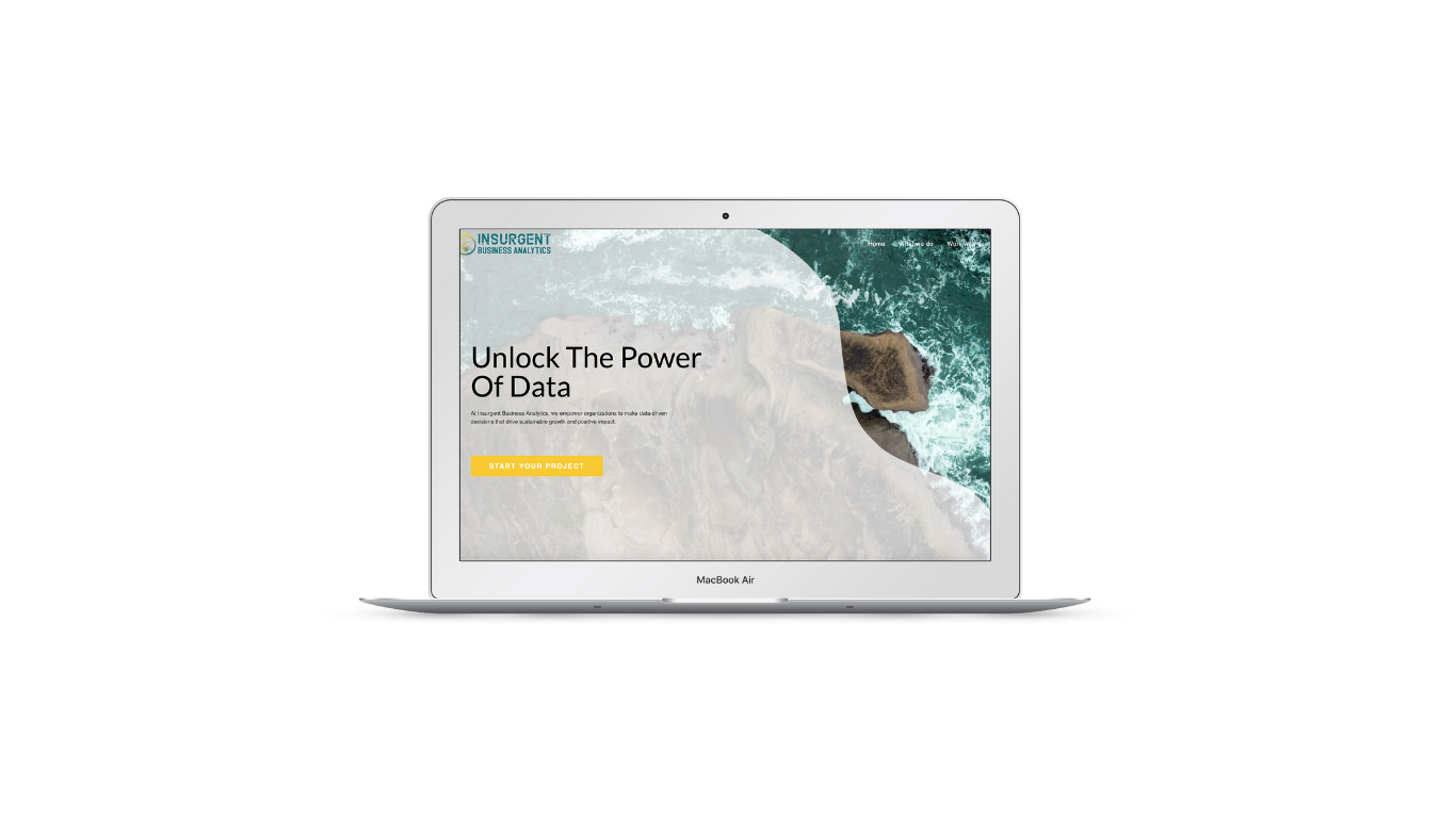
After Redesign